Project 1
Enhancing Search Results to Empower Users
in Making Airline App Decisions
As part of my UXDI studies, I undertook a comprehensive project focused on designing an airline app from scratch. This project involved the entire process, starting from problem identification and concluding with a final design solution. Throughout the project, I incorporated various techniques such as affinity diagrams, flow diagrams, design principles, design patterns, prototyping, and handover.

The Challenge
How might we help users find the best flight date and price combination with confidence and ease?
From reviewing usability test videos and conducting interviews, it became clear that users were frustrated by the difficulty of browsing price options across dates. The lack of clarity around pricing plans further discouraged decision-making.
Research & Discovery
Competitive Benchmarking
I analyzed top-performing airline apps to understand how they approach search flow and pricing filters.
User Research
Usability test videos helped uncover real frustrations during flight selection. I took detailed notes during these sessions to capture user behaviors and emotional responses. Interviews with friends and family provided additional qualitative feedback, and note-taking throughout helped identify recurring pain points and insights. Surveys were planned but not completed due to time constraints.
Synthesis Techniques
-
Affinity Diagram (collaborated with 2 classmates) to cluster user pain points (see below image or click here to see miro file)
-
Customer Journey Map to visualize the emotional flow (see below image or click here to see miro file)
-
Flow Diagrams to simplify the user path, particularly on mobile (click here to see miro file)


Design Process
Defining the Problem
Users needed a clearer way to browse and compare date + price combinations and to understand pricing tiers at a glance.
Applying Design Principles
I focused heavily on:
-
Consistency across interactions
-
Clarity in presenting data
-
Accessibility in navigation and font choices
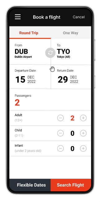
Mobile Focused Prototyping
I created:
-
A clean mobile-first UI prototype
-
A swipeable “flexible pricing” feature showing week-long pricing by date
-
Clear visual breakdowns of flight pricing plans
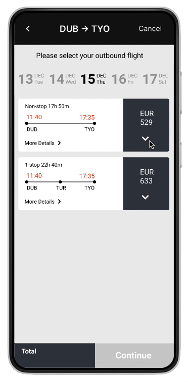
Key Solution: Flexible Price Explorer
One standout feature was a swipeable weekly price calendar. When users choose “flexible pricing,” they see:
-
All price combinations across a week
-
A simplified, swipe-left/right layout
-
Visual highlights of the lowest fare for the chosen destination
This directly addressed the pain point of comparison fatigue and empowered faster decisions.
Testing & Refinement
I conducted:
-
Mobile usability testing on prototypes
-
Iterated based on task completion rates and user feedback
-
Added annotations for a developer handoff
Each version improved clarity, and users were able to find date/price matches faster and with less confusion.
Annotation


Results
-
Users reported reduced frustration when searching flexible date options
-
Improved task success rate and satisfaction during usability testing
-
Pricing plans were now easy to understand and clearly explained
-
A more efficient and enjoyable flight booking experience overall
Tools & Skills Used
-
Figma (wireframe & prototyping)
-
Miro (Affinity Diagrams, Flow Diagrams, Customer Journey Map)
-
UX principles & design systems
-
Mobile interaction design
-
Developer handoff & annotation
Reflections
This project was a turning point in understanding how deeply usability challenges impact decision-making. What started as a simple flight search evolved into a nuanced look at how design can reduce friction, empower users, and clarify choices.
It also highlighted the power of systems thinking, pattern libraries, and collaboration in building consistent, intuitive experiences—even in something as complex as airline booking.